
There’s still a certain novelty about seeing Mario and Sonic standing side-by-side, and that’s what makes this box art pretty special. It’s simple, yet with the massive stadium in the background, you know exactly what it’s all about.

Speaking of simple, the design for Sonic Colors Ultimate is really lovely, and it stands out in the crowd thanks to the, well, colours! Granted, the glow around Sonic looks like something we’d knock up here on Nintendo Life, but it’s pretty cool.

Oof, this one’s nice. Bar Sonic Origins, it’s the only game that features Amy, and it’s lovely to see the four characters share some space. Of course, Sonic is taking up most of said space, almost like he’s saying “no, don’t look at them, I’m right here!”.

Mmmm. Oh yeah. The obvious callback to the Mega Drive / Genesis with the background here is excellent, and the sheer number of characters showcased feels like a real celebration of the series’ inception. Lovely stuff.

Man, there’s a lot going on here, and we’re not even sure we noticed the dinosaur over on the left until we inspected the box art for this very brawl. It’s cool stuff though, and clearly conveys the core mechanic of crossing over into different tracks.

Shadow. Enough said.

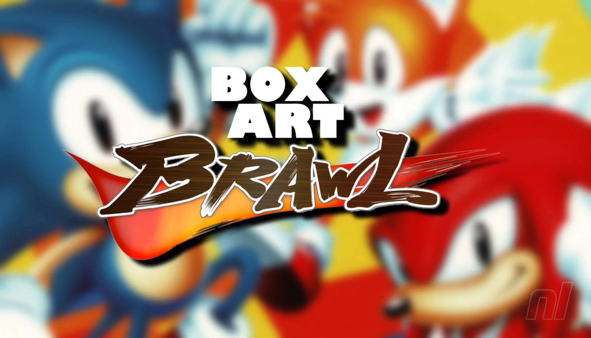
There’s something about that yellow background, huh? It’s absolutely gorgeous. The simple combination of Sonic, Tails, and Knuckles feels pretty iconic too, while the focus on the more classic character designs reminds us of simpler times. Yeah, this is a good one.

Look this isn’t bad, it’s just… okay yeah, it’s kind bad. It’s just lacking that oomph that you want from a Sonic racing game, and we’re not sure why Sega decided to go with those hazy character close-ups. Focusing on the action seen in the lower portion of the design would have been much better.

Whatever you might think about Sonic Frontiers, there’s no denying that it’s box art is absolutely stellar. The action shot showing Sonic grinding along a rail has become pretty iconic for the character’s modern age, and the logo design is really nice too.
Thank you for voting! We’ll see you next week for another edition of Box Art Brawl!